Stop Analytics
Stop Analysis gives you a structured view of all stops for the selected period. Use it to identify patterns, compare stop categories, and understand where production time is being lost. By combining flexible grouping with multiple visualization options, the view adapts to both quick overviews and deeper analysis.
The time period is selected using the time picker at the top of the view.
Stop Analysis is available at multiple levels in the system. Navigate to a specific machine to analyze stops for that machine, or move up to a group, department, or plant level to get an aggregated view across multiple machines. This makes it possible to compare performance between lines or departments, and to identify whether a problem is isolated to one machine or part of a broader pattern.
Groups and filtering
On the left side, the row groups panel lets you slice the stop data by different dimensions – such as category, code, duration, or article. Drag groups up or down to change the grouping order and build the view that fits your analysis. Groups that are not in use are available in the unused groups section below, ready to be dragged in when needed.
This makes it possible to answer specific questions quickly – for example, which stop category accounts for the most lost time, or which article triggers the most unplanned stops.
Pie chart
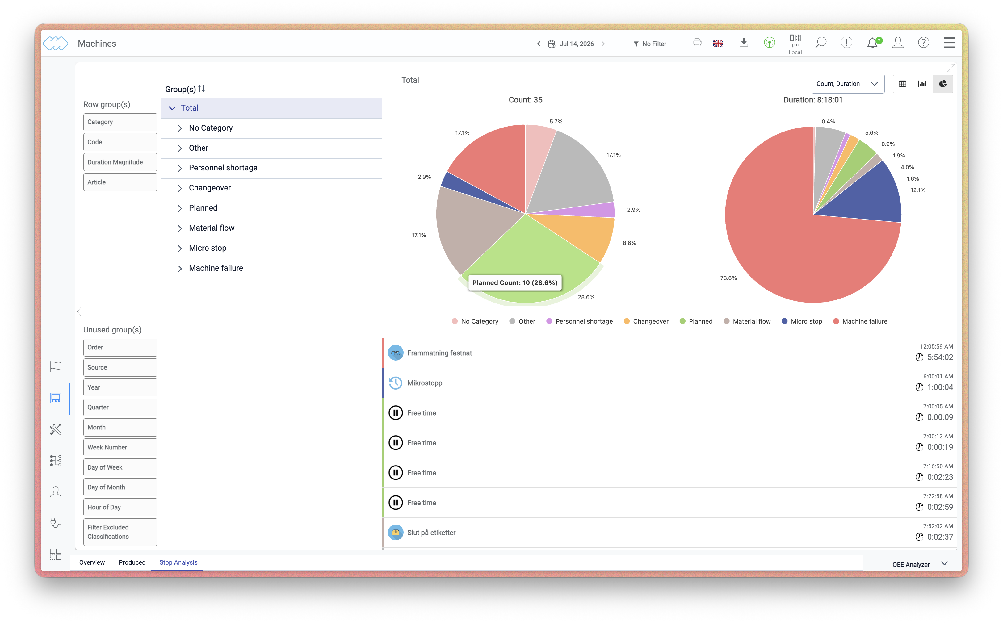 The pie chart shows the distribution of stops as a proportion of the total, either
by count or by duration. It is well suited for getting an immediate sense of which
stop categories dominate and how the losses are distributed across the selected
period. Use it when you want a high-level picture before drilling into the details.
The pie chart shows the distribution of stops as a proportion of the total, either
by count or by duration. It is well suited for getting an immediate sense of which
stop categories dominate and how the losses are distributed across the selected
period. Use it when you want a high-level picture before drilling into the details.
Bar chart
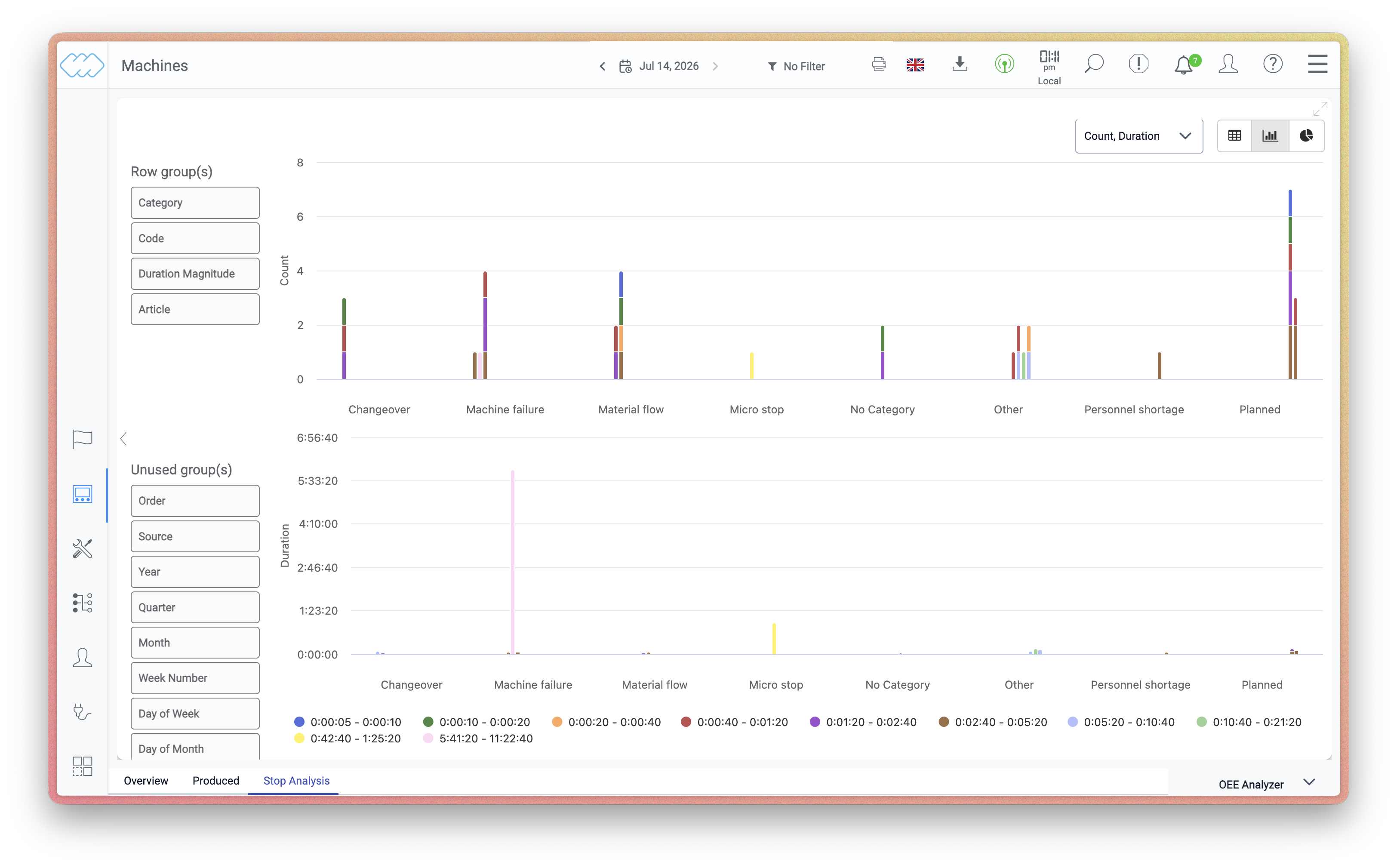 The bar chart displays stop categories side by side, making it easy to compare
volumes across categories. It is particularly useful when you want to rank categories
against each other or spot which ones stand out. Switching between count and duration
in the dropdown can reveal different patterns – a category with many short stops may
look different in count versus duration.
The bar chart displays stop categories side by side, making it easy to compare
volumes across categories. It is particularly useful when you want to rank categories
against each other or spot which ones stand out. Switching between count and duration
in the dropdown can reveal different patterns – a category with many short stops may
look different in count versus duration.
Table
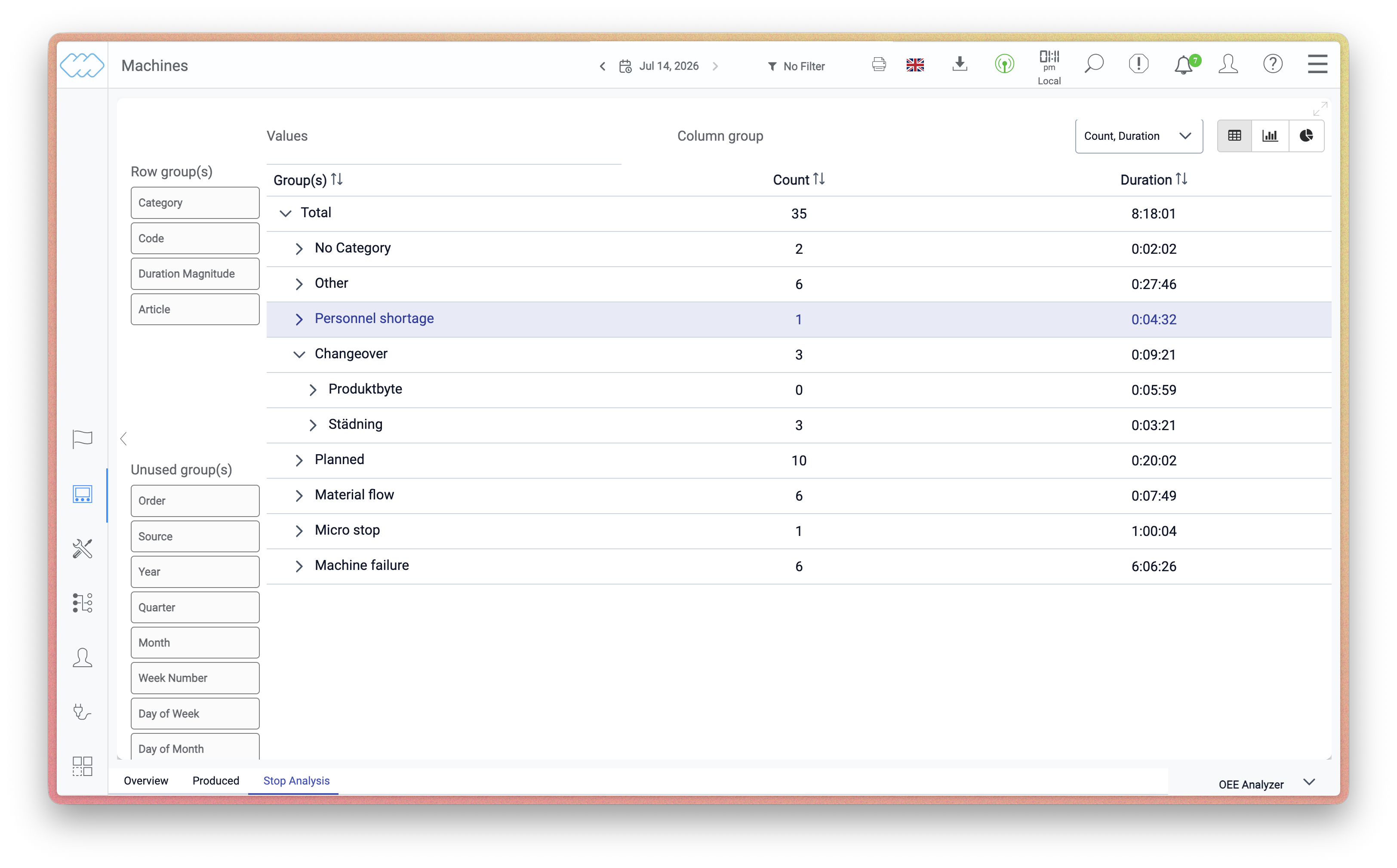 The table view provides a detailed breakdown of all stops, with configurable columns
so you can focus on the data most relevant to your analysis. Expand categories and
codes to drill down into individual stops, including timestamps and duration. The
table is the right choice when you need to export data, investigate specific events,
or prepare material for a maintenance or planning review.
The table view provides a detailed breakdown of all stops, with configurable columns
so you can focus on the data most relevant to your analysis. Expand categories and
codes to drill down into individual stops, including timestamps and duration. The
table is the right choice when you need to export data, investigate specific events,
or prepare material for a maintenance or planning review.
Customization
The table can be extended with additional rows and columns to match the needs of your operation. By combining different group dimensions and column configurations, you can build a view that gives you exactly the data points that matter for your follow-up.
If you need help setting up Stop Analysis to get the most out of your production data, our Customer Success team is available to help. They can assist in configuring the view, identifying the right dimensions to track, and making sure you have a complete follow-up that makes a real difference in your operation.